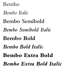
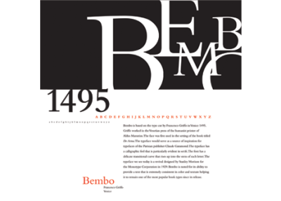
In 1495, a man by the name of Francesco Griffo who worked cutting letters for Aldus Manutius (an acclaimed typographer, editor, and owner of the Aldine Press in Venice ), created a new serif typeface known today as “Bembo”. The design was first used in the book “De Aetna” written by Cardinal Pietro Bembo, whom the typeface was later named after.
In 1929, the typeface was revived through the guidance of Stanley Morison who worked in collaboration with the “Monotype Coorporation”. This revival of Bembo is a slightly adapted take on Griffo’s original design, and is the style of Bembo most similar to the typeface seen in the 21st century, although the digitalization of Bembo has faced some struggles in recreating the typeface into it’s original beauty.
Bembo was most commonly used as a typeface for books, escpecially book faces, as it was viewed as flowing and being pleasing for the eyes, while still remaining strong and relatively formal. The typeface is classified as “old-style” due to factors such as the angled serifs on the ascenders, a grander contrast between the thick and think strokes, and the upright position the letters demonstrate rather than tilting or slanting to the side.
The most current digital revival of this font was designed in 2005 by Robin Nicholas and goes by the name of “Bembo Book”. This version of the digital typeface is said to be more similar to the original metal font than the first digital rendition of Bembo. The digital typeface can be bought from several website that license out the rights to use the type on various platforms. The typeface can be purchased from various websites such as myfonts.com and linotype.com, who sell the typeface and allow it be used for commercial use and promotional purposes as stated in the end-user license agreement.
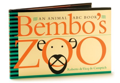
Bembo is a strong example of a typeface that has been carried through the centuries, succesfully adapting to new technologies and audiences. Bembo is the definition of a true, classic typeface that carries history and tradition as it continues to travel today through literature, advertisements, and pop culture.
Works Cited
“Bembo.” Typophile. N.p., 16 May 2005. Web. 23 Sept. 2014. <http://typophile.com/node/12480>.
“History of Typography: Old Style.” ilovetypography. N.p., 6 Dec. 2007. Web. 23 Sept. 2014. <http://ilovetypography.com/2007/11/21/type-terminology-old-style/>.
Milbourne, Alex. “Bembo History.” Typography and Graphic Design. N.p., 27 Oct. 2011. Web. 23 Sept. 2014.
“Typefaces as History: Aldus Manutius and The Noble Bembo.” The Book Designer. N.p., 22 Oct. 2011. Web. 23 Sept. 2014. <http://www.thebookdesigner.com/2010/10/typefaces-as-history-aldus-manutius-and-the-noble-bembo/>.


