

Daily Dose

For better or worse

Narcotism

My Ray of Hope

Memorabilia

Stuck in a haze

The perfect cut

The Family Heirloom

Pretty in Pink

Tangled in a Knot

Under the Covers

Child’s Play
Project 3- Part A
Project 2 (Image Source)

The image I selected for my backdrop on my Project 2 Process Assignment can be found on – http://somethingaboutunitx.mmu.creativematchmaker.com/category/uncategorized/page/3/
Process Brainstorming

The process maps were an interesting approach to brainstorming; many of the techniques were new to me and brought out ideas I likely would not have thought of initially. Looking into things deeper, and seeking fine details helps to create a richer idea of possible work and ideas that can be used for the project in the future.
The brainstorming session that helped me the most was the 50 questions. When I started out it was difficult to think of questions to ask, but once I began it became easier and the questions became more unique and looked at things from a completely different view than the original questions. It started out as a question about applying makeup and ended with questions relating to gender conformities and cultural differences, seeing how makeup is accepting in different societies and how those who do not follow the norms of society are isolated or alienated.
Another technique I found helpful was the mind map. It started out as one statement but as the tree grew I discovered an abundance of other points that related to the topic was analysing. Many of them were miniscule points that I would have likely not thought of without deeper thought and the connections that were provided while working through the mind map. With the help of a visual I could imagine and guide myself to come up with more specific information and finer details.
I hope to use some of the techniques I used for this assignment in future projects to help stimulate ideas and give me in-depth work rather than just hitting the surface.
Part D – Project 1

Part D
Working with the layout and presentation of a paragraph proved to be much more difficult than I had anticipated. When I started out I realized that I was not attracted to paragraphs that appeared overly complex and difficult for the brain to piece together. Due to this revelation I kept my layouts quite simple and minimalist.
For my first piece I broke the paragraph up into sections based on the timing of events, and putting emphasis on the first and last line within the paragraph, making them take up a larger quantity of space and therefore capturing the reader’s attention.
For my second piece I centered all the lines and then balanced out the sentences so they would create a unique silhouette. This meant finding appropriate places for the lines to be separated so that the sentences would still flow when reading the paragraph, but also look visually appealing when looking at the paragraph from a distance.
This being my first experience with typography and layout meant I had to test things out and find what I was drawn to and reflected my taste and visual interests the best. I think in the future I will be able to take things to the next level as my skills begin to expand and my technique grows. This is definitely a skill that will improve over time and with practice, but having the basics is a great place to start and I can’t wait to use the things I have learned to create work in the future.
Expressive Typography

My experience creating typographic posters for part C of our 1st assignment was quite challenging as it was something I have only worked on a couple times before and don’t have much practice or knowledge in how to make a unique and interesting piece.
When working on this assignment I used a trial and error method to decide what I thought looked nice and was a different and creative approach to the word. I was interested in using the letters to create shapes such as lines, triangles, and polka dots. It made the work appear more abstract and at times you do not even notice the shapes were once a portion of the key word. I also worked a lot with the opacity of the letters and “shapes” to find a balance where your focus would still be on the word and the additional items would not become a distraction.
It was difficult to stay away from doing direct representations of the word because that is what your imagine is drawn to and thinks of automatically, but to make sure the work is not overly cliché it was necessary to keep those representations out as much as possible, although it did come up in my work a couple times.
For me creating analog sketches beforehand was more challenging than attempting to create something on the computer right off the bat because it was hard to imagine what the letters would look like and how the spacing would be once you made the work digital. That is why the majority of my hand sketches did not make the cut into my final pieces of work and I veered in different directions.
My final struggle was knowing when something was done, asking the question “is there too little on this poster?” or “is this poster crowded?” It is difficult knowing if something is too simple or if it is just the right amount.
Overall, I really enjoyed working on the typographical posters and I am excited to explore design more throughout the next couple assignments.
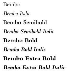
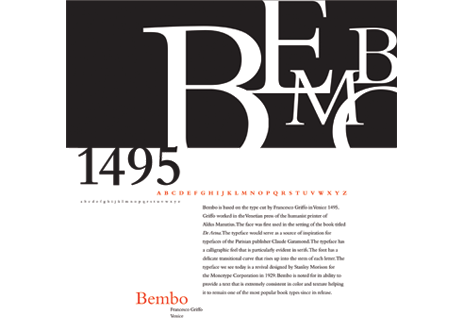
The History of Bembo
In 1495, a man by the name of Francesco Griffo who worked cutting letters for Aldus Manutius (an acclaimed typographer, editor, and owner of the Aldine Press in Venice ), created a new serif typeface known today as “Bembo”. The design was first used in the book “De Aetna” written by Cardinal Pietro Bembo, whom the typeface was later named after.
In 1929, the typeface was revived through the guidance of Stanley Morison who worked in collaboration with the “Monotype Coorporation”. This revival of Bembo is a slightly adapted take on Griffo’s original design, and is the style of Bembo most similar to the typeface seen in the 21st century, although the digitalization of Bembo has faced some struggles in recreating the typeface into it’s original beauty.
Bembo was most commonly used as a typeface for books, escpecially book faces, as it was viewed as flowing and being pleasing for the eyes, while still remaining strong and relatively formal. The typeface is classified as “old-style” due to factors such as the angled serifs on the ascenders, a grander contrast between the thick and think strokes, and the upright position the letters demonstrate rather than tilting or slanting to the side.
The most current digital revival of this font was designed in 2005 by Robin Nicholas and goes by the name of “Bembo Book”. This version of the digital typeface is said to be more similar to the original metal font than the first digital rendition of Bembo. The digital typeface can be bought from several website that license out the rights to use the type on various platforms. The typeface can be purchased from various websites such as myfonts.com and linotype.com, who sell the typeface and allow it be used for commercial use and promotional purposes as stated in the end-user license agreement.
Bembo is a strong example of a typeface that has been carried through the centuries, succesfully adapting to new technologies and audiences. Bembo is the definition of a true, classic typeface that carries history and tradition as it continues to travel today through literature, advertisements, and pop culture.
Works Cited
“Bembo.” Typophile. N.p., 16 May 2005. Web. 23 Sept. 2014. <http://typophile.com/node/12480>.
“History of Typography: Old Style.” ilovetypography. N.p., 6 Dec. 2007. Web. 23 Sept. 2014. <http://ilovetypography.com/2007/11/21/type-terminology-old-style/>.
Milbourne, Alex. “Bembo History.” Typography and Graphic Design. N.p., 27 Oct. 2011. Web. 23 Sept. 2014.
“Typefaces as History: Aldus Manutius and The Noble Bembo.” The Book Designer. N.p., 22 Oct. 2011. Web. 23 Sept. 2014. <http://www.thebookdesigner.com/2010/10/typefaces-as-history-aldus-manutius-and-the-noble-bembo/>.

For my well designed piece, I chose this board game that was sitting in my house. I noticed it really stood out amongst the other games in the closet due to the fact it had a strong black background with a variety of words in different fonts and sizes, all in a glossy silvery colour. When I pulled the game out of the closet your eyes go directly to the title of the game (Cranium) because it is the only portion of the box that has a pop of colour. Another addition that makes the box unique are the see-through panels on the top, right-hand side of the box that let the players see the characters they will get to use during the game. This also adds a small touch of colour to the top of the box and your eye is drawn to look in and open the box to see more.
Once you open the box the board is designed in a manner that makes it easy for players to comprehend the flow of the game. It is easy to follow the game because the places your player should go are easily highlighted in bright colours, each colour representing a different category. This game is overall extremely well designed to draw players into the game, and once they have started to play the game is set up in a way that is easy to follow and visually understand.
I also appreciate that this board game goes against the grain of what a typical board game looks like. Instead of being a generic square or rectangular board, the designers worked with a “plus” shape and then used more organic shapes on the board to create visual interest rather than having a straight cut design that would appear more serious than fun and exciting.
This game is a perfect example of a design that is appealing and functional!
